The British have Gill Sans, the French, Garamond, the Italians, Bodoni, the Swiss, Helvetica. Is there a relationship between a typeface and place? Can a typeface have a regional accent?
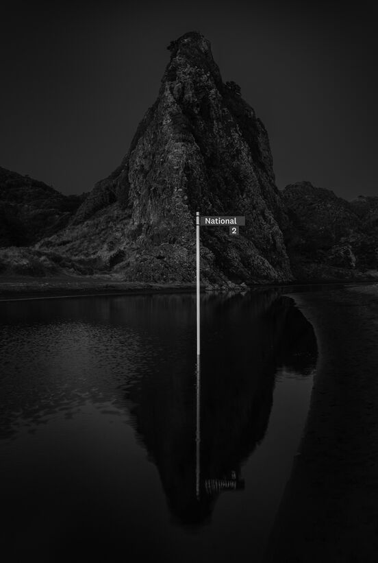
With a lack of digital typefaces to choose from, and motivated to create a typeface that local designers could use to communicate with rather than reaching for foreign ones, typeface designer Kris Sowersby began investigating a typeface that would be from New Zealand. It was first released in 2007 and was named National.
Now National is everywhere, especially here at home. It’s on the front cover of the Anthology of New Zealand Literature and in the New Zealand Fashion Design encyclopedia. It’s there every time you pass a Z petrol station or a Westpac billboard. It’s at Te Papa Tongarewa, the Christchurch Art Gallery, and throughout the branding of Victoria University. It’s on everything at Xero. It’s the face of newzealand.com for New Zealand Tourism. It’s even been pulled into politics by the Green and Labour parties. When we want to say “New Zealand”, we seem to reach for National.
Typefaces give form to the alphabet. They function as carriers of information, selected and circulated through labour, capital and culture. We encounter letterforms daily, but most of the time we are oblivious to their origins or craft. While typefaces have personas and create atmosphere, their characteristics seldom point back to their place of origin or their maker.
Yet it is through use that typefaces become meaningful to people – and not just to designers. When a typeface is used intensively within a community of practice, over time it can become a signal for that community’s values. That typeface might say things about who belongs to that community and what they represent. Working with photographer Alistair Guthrie There is no such thing as a New Zealand Typeface asks questions about the relationship between typography and place, text and landscape, and ultimately identity.
--
Typeface designer Kris Sowersby founded Klim Type Foundry (Klim) in 2005. He studied at Whanganui School of Design and worked briefly as a graphic designer before starting Klim. Since releasing his first retail typeface, Feijoa, in 2005, Kris has received numerous awards and accolades, including: a Certificate of Excellence from the New York Type Directors Club for his second typeface, National, in 2008; being named an ADC Young Gun in 2010; being accepted as a member of the prestigious Alliance Graphique Internationale (the second New Zealander to do so) in 2013; and receiving the John Britten Black Pin in 2015, the highest award given by the Designers Institute of New Zealand. Kris has designed custom fonts for such clients as The Financial Times, PayPal and National Geographic.